P&O App
P&O have worked with MRM Meteorite for a number of years of numerous successful projects and campaigns. They approached us to take a look at an App that had been created, but not yet built, and was in need of a fresh set of eyes to both improve the User journey and maintain brand quality control.
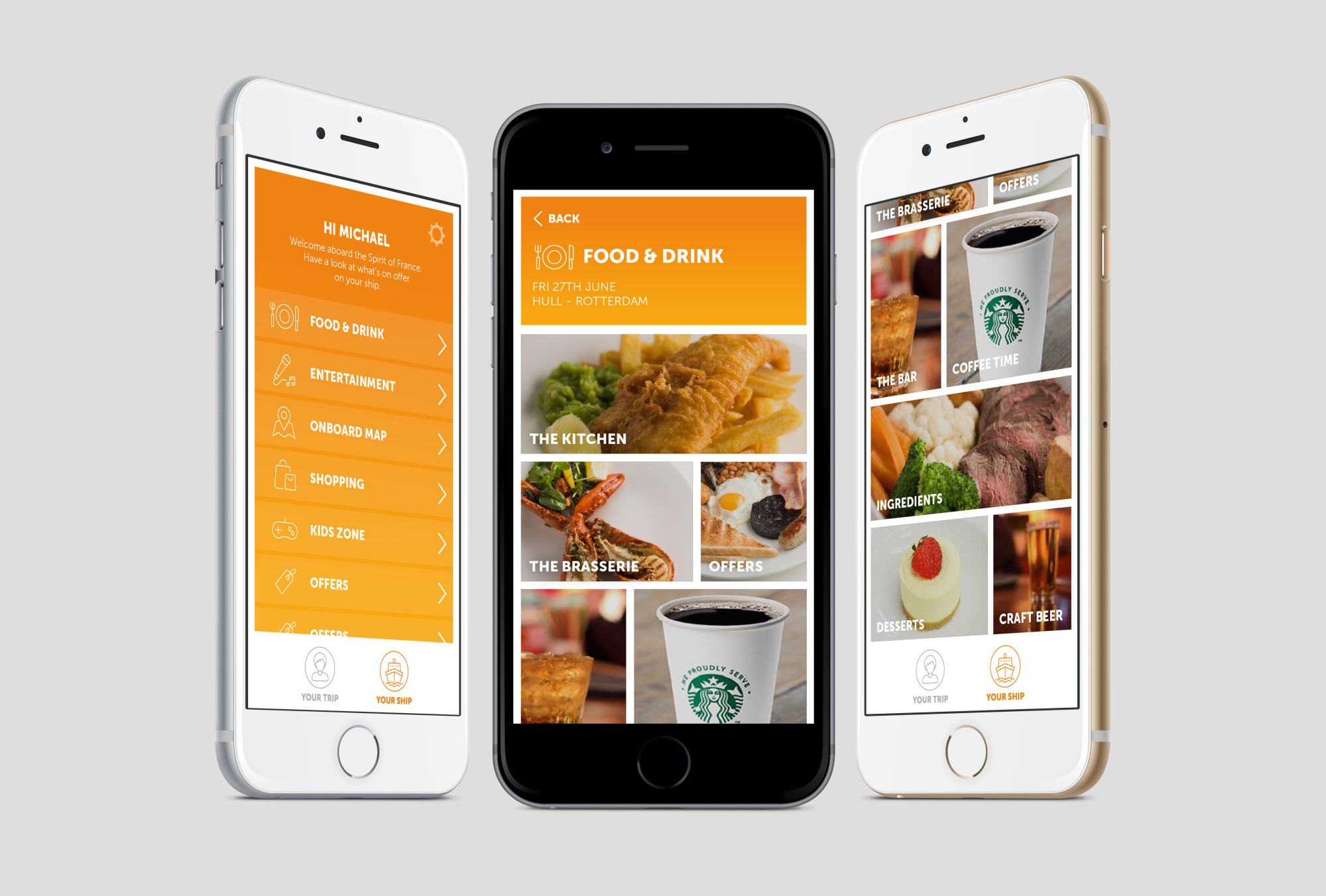
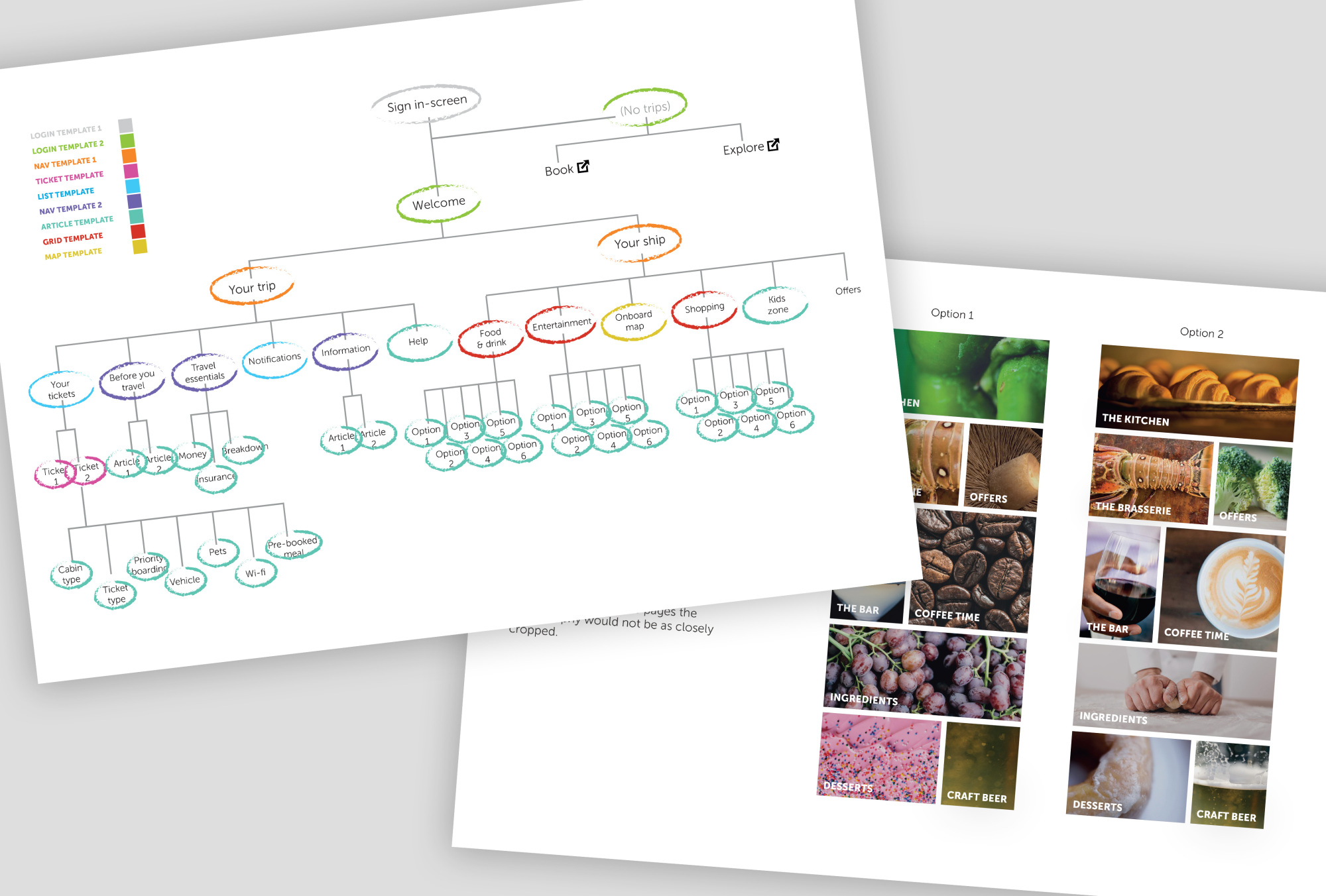
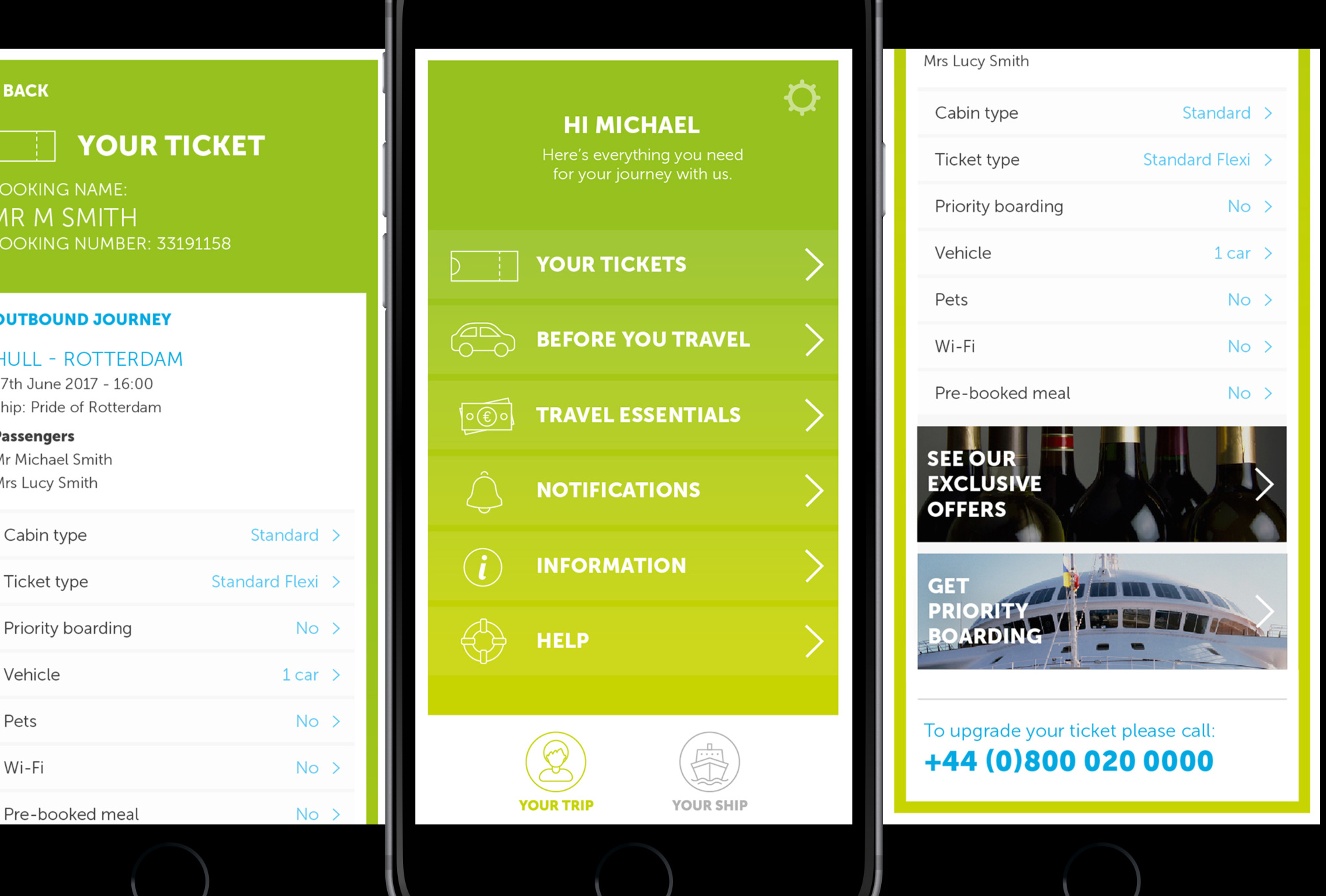
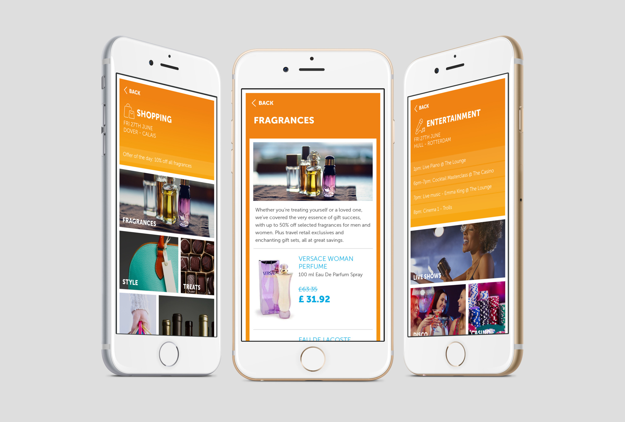
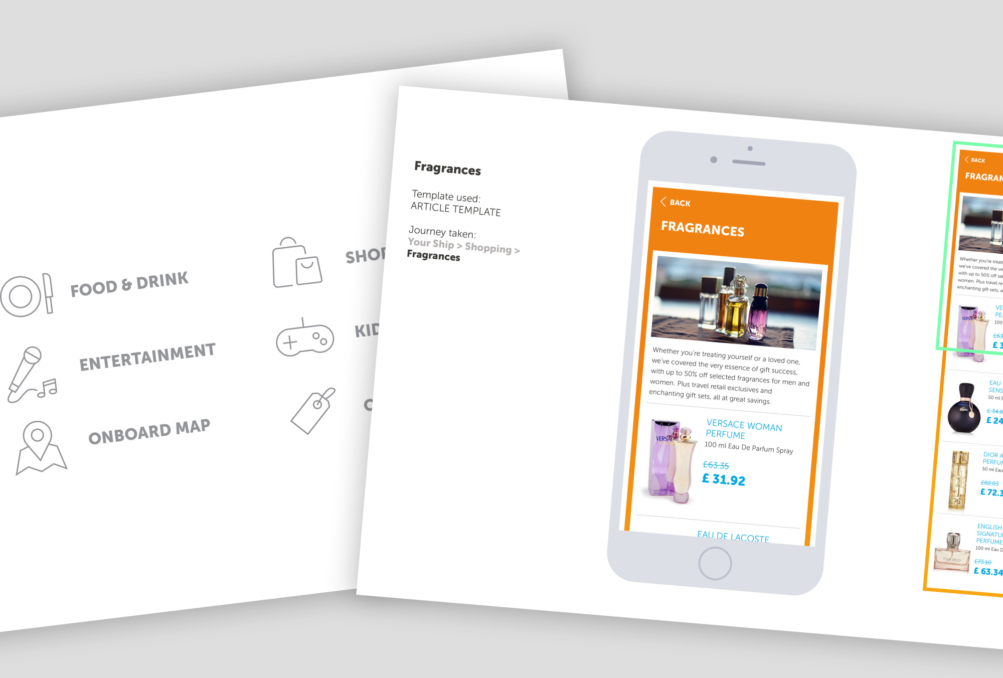
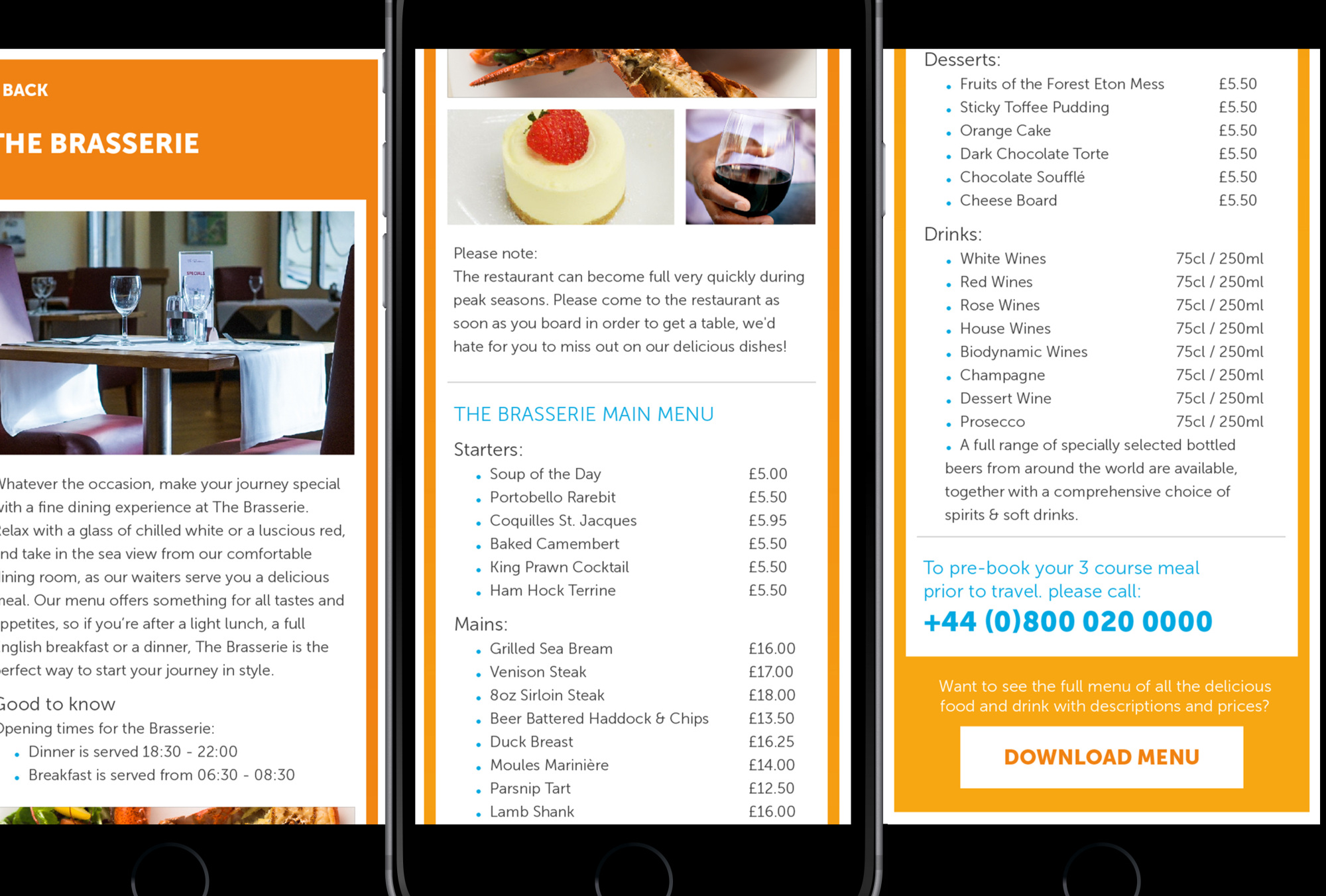
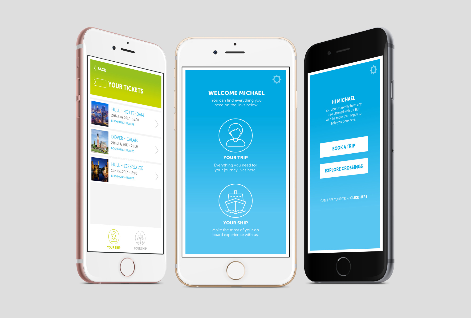
The app has a dual benefit of working for the customers by making their life easier and helping them to make the most out of their trip, whilst also reducing the strain on P&O staff by guiding customers at each stage of their journey and helping to create cross-sell opportunities. We did this by simplifying the app navigation, with two clear behaviours identified, that of ‘Your trip’ or ‘Your ship’. The first section, ‘Your Trip’ contains all of the key details surrounding the customer’s trip. E-Tickets, travel information, travel money and notifications are all one touch away so that customers can access the information they need quickly and easily. The second section ‘Your Ship’ is designed around the customer’s time on board their P&O ferry. From here they’ll be invited to explore everything the ship has to offer, from shopping and entertainment to the best places to eat and drink. We also created a completely new UI for the app, which was fresh, modern and aspirational. We produced a consistent approach to icon styles, call-to-actions, and colour-ways for signposting. We also implemented a Photographic style that would encourage customers to explore more of the ship, by feeling contemporary and aspirational, yet still natural.
The work done on the app was received with a glowing reception from the Client, and a lot of the visual styles used have since informed improvements to other parts of the P&O digital offering.